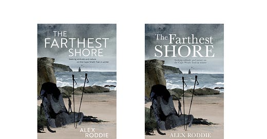
What's in a cover design?
It's often said that the cover is the most important element of any book. Here's a glimpse into what goes into creating a non-fiction cover.
My first narrative non-fiction book, The Farthest Shore, is due to be published in September 2021 by Vertebrate Publishing. The book is a bit of a cross-genre chimera. Ostensibly a memoir about hiking the Cape Wrath Trail in winter, it is also nature writing by stealth, an exploration into the relationship between the internet and solitude, and a personal journey. I do not think of it as a ‘hiking book’, although its true identity is something for the market to decide. The title is a direct nod to Ursula Le Guin’s classic The Farthest Shore – one of the Earthsea novels, and an important reference and metaphor throughout.
This all presents something of a marketing quandary. The most important thing to know about creating a book’s cover is that the author’s artistic vision is of secondary consideration. Our books tend to get tangled up in our identities; in a very real way they are our identities, or shards of them hacked free from grey matter and cast out there hopefully into the world. This process of creation is painful. In the book I ask if our smartphones (or more specifically our immaterial digital bodies) are horcruxes, but for writers I think that this is even more true of our books. A book is a tiny portion of our own soul sent out there to live in the minds of others. ‘My book is my baby’ is a phrase commonly heard amongst writers. No wonder we feel so strongly about cover designs.
My own concept of this book’s cover was clear from a very specific point on the Cape Wrath Trail itself: the moment when I came face to face with the whale skull on the beach at Sandwood Bay. So many things crystallised for me in that moment. The cover would be a dreamlike interpretation of the encounter, but the sky would be alive with the lights of the Milky Way, representing my inner journey.
Obviously, this was never going to be the book’s actual cover. Imagine a potential customer walking into a bookshop and seeing such an abstract image. What’s this book about? Why should they buy it? Too many unanswered questions and mixed messages. Easier to pass it by and pick up something less opaque.
A book’s cover has three main purposes:
To grab the attention of a member of the target audience;
To inform them of genre and theme, and hint at the story;
Ultimately, to sell them the book.
When considering these practical requirements, it’s clear that cover design is something better handled by marketing and design professionals. In most cases, the emotion-fuelled author is too close to the material. There are exceptions to this rule – some author-created covers are both effective and beautiful, and some authors are able to disconnect their emotions and see their book as a product to be marketed and sold. This is very important if you go down the self-publishing route. But I’m with a traditional publisher, and I know that I’m rubbish at the marketing side of things.
Where I think true success in cover design can be achieved is in a meeting of minds between the practical considerations of marketing and the artistic vision of the writer. Not all publishers ask their authors for input, but I’m lucky; my editor has been excellent at consulting me and taking my opinions on board. Originally Vertebrate were looking to go with a photograph, but I thought that a piece of original artwork would work best because I wanted a nod towards the contemporary style for the genre of nature writing. They agreed. With the disclaimer that I knew this would not work as an actual cover design, I explained my original thoughts for an image, and asked if we could consider something based on Sandwood Bay – a location that I believed could effectively convey both ‘hiking memoir’ and ‘nature writing’.
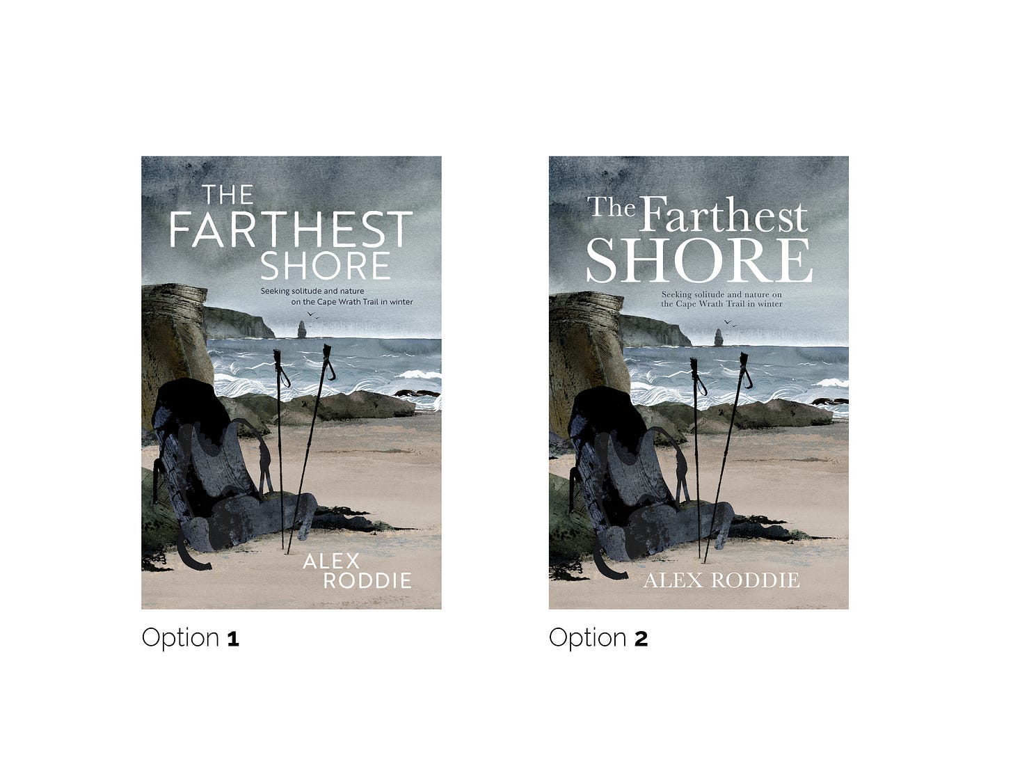
Vertebrate worked with a talented artist called Chellie Carroll. Initial mock-ups were very encouraging, and after several rounds of feedback we arrived at a design that everyone was happy with. The next question mark was typography. Three different options were proposed. After one was vetoed, the remaining two were put to social media to see what the popular vote would be. This is clever on Vertebrate’s part – not only does it help to gauge the popularity of a potential design, it also gets a lot of people thinking and talking about a future release.
The design is probably not final. A few people have pointed out that the rucksack is hard to discern from the background, especially at thumbnail sizes, and some think that the colour scheme is slightly too muted. I’ve passed feedback from my own contacts back to Vertebrate. There will doubtless be further tweaks to the typography as well. Overall, though, I love this design and I think it will be effective.
Different publishers have different ways of doing things, but I hope that this gives an insight into some of the factors involved in creating a non-fiction book cover. It’s about much more than what the author wants – although that is most definitely a factor. No writer wants to put their name on a cover they hate.
In other news
Apologies that I missed last weekend’s newsletter. I have three big deadlines rapidly approaching: Sidetracked Vol. 21’s print deadline at the end of the month, the submission date for my next big book project with German publisher gestalten, and my GPS watch comparative review with TGO magazine. Next month should be a bit more chilled, and I’ll be able to focus on getting some serious word count in for my next Vertebrate manuscript.
I’m thinking about declaring myself fully booked for the year. Right now, I might be able to squeeze in one more editorial project, but my time is being claimed rapidly and I’m wary of leaving myself no margin for hills. As always, if you would like to hire me to edit your next book, please get in touch as early as possible.
Until next time,
Alex
If you’d like to support my writing and photography, you can buy me a coffee. Thank you!
If you enjoy my email letters or find them interesting, please tell someone else. Here is the signup link you can share: https://thepinnacle.substack.com


